- Apr 30, 2020
 0
0- by A2 Marketing Team
When you create a website for your business, you want to put your best foot forward. A sloppy website diminishes your credibility, and can be hard to use. Plus, visitors may become impatient if they can’t find what they’re looking for.
Fortunately, there are a few easy steps anyone can take to create a professional website, regardless of your innate design talent (or lack thereof). Techniques like creating a clean layout design and optimizing your site for mobile devices will go a long way toward making sure it reflects well on your business.
In this article, we’ll explore seven of the most important elements you’ll want your business website to have. Let’s get started!
The Importance of Professional Website Design
Design is about more than appearance. The way content is organized can mean the difference between a page visitors can quickly skim, and a chaotic jumble of text. This means you’ll want to design your site strategically, using colors, text sizes, and fonts to highlight the most important information and demarcate sections.
Well-designed websites benefit from improved ease of navigation and readability. This in turn should help to improve your rankings in search engines. There’s a ripple effect to consider here: the better designed your website is, the more visitors will use it and interact with your content. In turn, longer session duration times boosts Search Engine Optimization.
Aside from being confusing, a poorly-designed website just looks sloppy – your visitors will naturally be more inclined to take you seriously if your site looks thoughtfully put together. If it’s hard to navigate, on the other hand, they may just leave.
In fact, 94% of browsers cite design first impressions as a reason they abandon websites quickly. This means that in order to keep visitors around, you’ll want to create a highly-professional site.
7 Hallmarks of a Professional Website
In the following sections, we’ll go over seven ways to make sure your website represents your business in the best possible light. These simple elements will help to ensure that visitors find all the information they came for, and leave your site with a positive impression.
1. Clean Layout Design
Layout design is about where all the elements on your page are, and how much space is taken up by each one. You don’t have to be Picasso to achieve an effective design, but your site’s layout should follow the basic rules of design. If not, it can become chaotic and hard to follow:
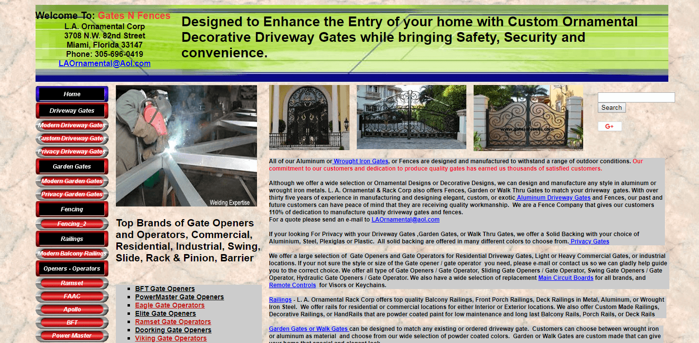
Clean design also makes your site easier to use. By emphasizing important sections and building a clear structure through design elements, you make it easier for visitors to skim through and find what they need.
To get started, you can achieve a lot by following the Rule of Thirds and visual hierarchy in your site’s layout. These are simple rules anyone can apply, which determine where important information is placed and how it is styled.
2. Ease of Use
Clean design doesn’t just mean sleek aesthetics. Your website should also be clear and easy to use. In other words, every element of the site should be built in a way that the average user can understand. Your visitors should be able to quickly dive in and do what they need to do.
For example if you sell products or services on your site, you’ll need to be sure that all the elements a customer will have to use are clearly marked:
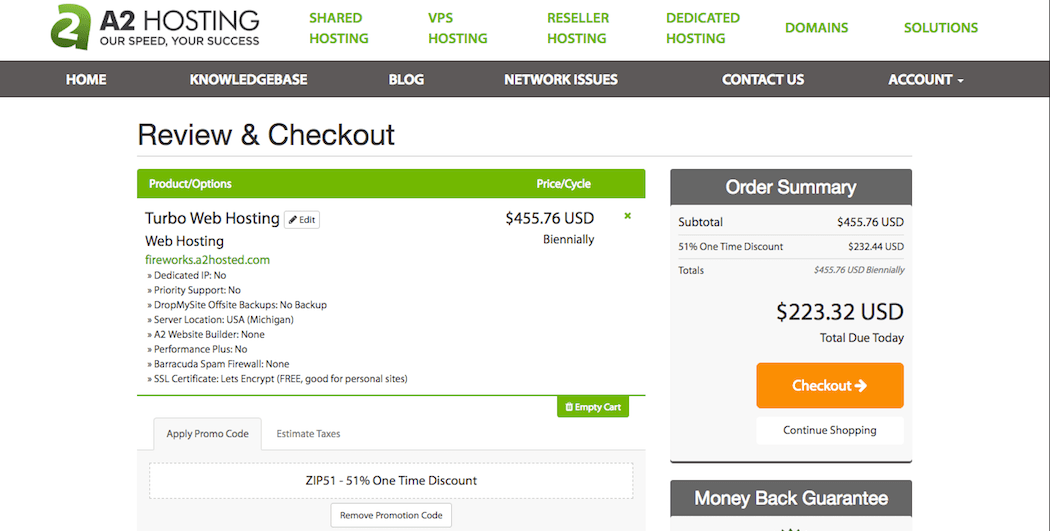
Have you ever had to hunt for Add to Cart and Remove from Cart buttons on a shopping site, or struggled to find the search bar? Issues like that make using a website frustrating, and can cause visitors to simply leave.
It might be hard for you to see your site from an outsider’s perspective, as you know how the site is meant to function. Therefore, you’ll want to get a few testers to run through the site as a first-time user would. Make note of anything they find difficult to use, as those are the elements you’ll want to focus on.
3. Excellent Performance
No matter how amazing your website looks, it won’t matter if its pages take too long to load. Website users have come to expect speed as a part of any professional website. Many will abandon a site that takes more than a few seconds to come up:

If you haven’t done so lately, therefore, you’ll want to take a few minutes and optimize your website’s speed. Making the most of your memory resources will ensure that visitors see your site promptly. If optimization doesn’t help, you may have outgrown your current server space.
4. Clearly-Written Copy
The text of a website is just as important as its appearance. A site that’s riddled with typos, spelling mistakes, and poor grammar will turn away visitors. So will copywriting that’s dull, hard to understand, or repetitive. If visitors take the time to read your site, they should be rewarded with sparkling, engaging prose.
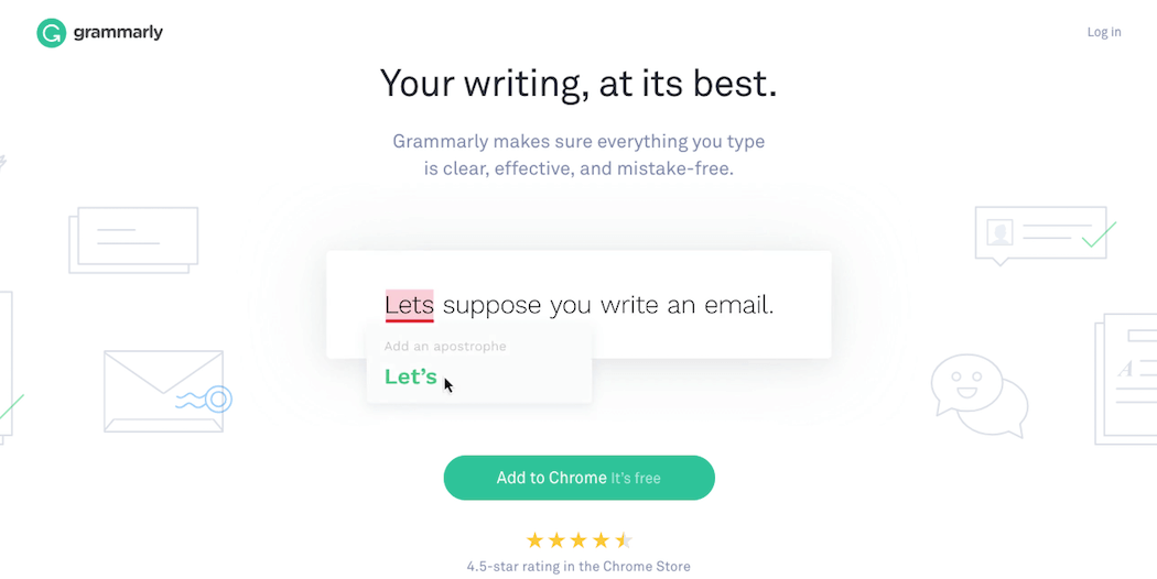
Fortunately, there are many online resources that can help you become a better copywriter. Most importantly, you’ll want to aim for clear, concise writing that is easy to read and thoroughly spell-checked. Tools like Grammarly can help with the latter:
If you don’t have the time to write compelling copy, you can also consider hiring a copywriting firm.
5. A Professional Logo
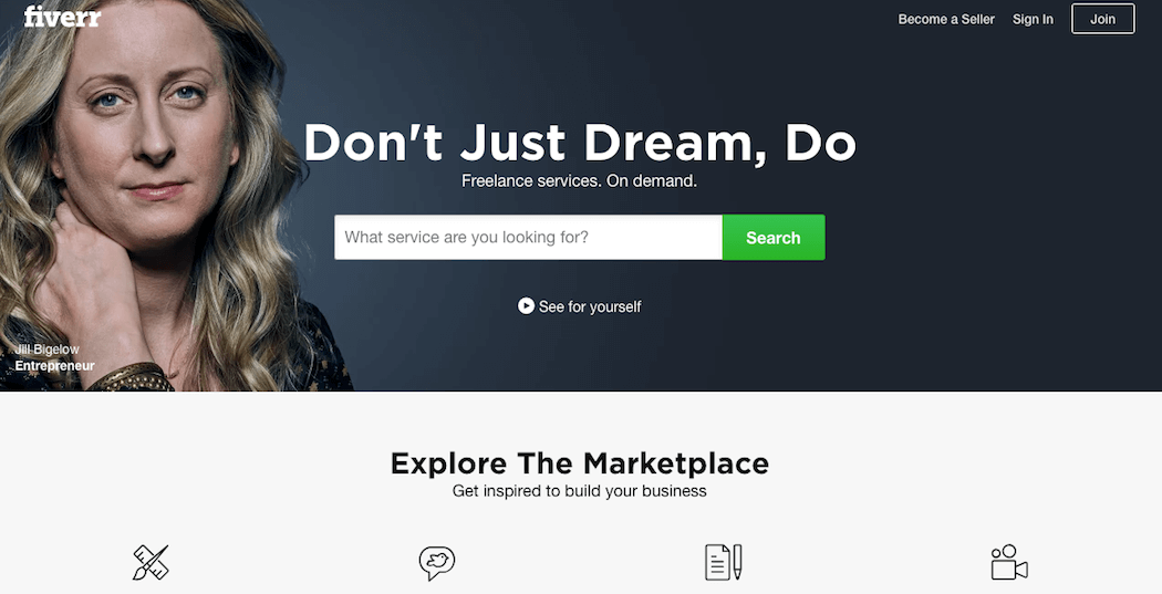
A logo is one of the first things new clients should see when they interact with any of your online content. A professional logo provides a visual cue to help visitors to remember your business. It doesn’t have to break the bank either, since you can get a professional-looking logo for $20 or less by hiring a freelancer on sites like Fiverr.com:
It’s even better to hire a professional designer if you have the budget for it, as they can create more unique and memorable branding. A professional logo can cost around $100-300, but It’s well worth investing in the ‘face’ of your business.
6. High-Quality Images
When using images on your site, you’ll want to ensure that they’re always of high quality. Using pictures that are blurry or pixelated looks unprofessional, especially in key images like your logo and header:

Unless it’s done intentionally, as with pixel art, a pixelated image just looks like a mistake – which is not a great first impression! You can avoid this issue by starting with high-resolution images, and then optimizing those images for web performance.
7. Mobile Optimization
These days, over half of your visitors will be on mobile devices. Therefore, it’s crucial to optimize your website for smaller screens. Otherwise, elements of your site may appear incorrectly or load poorly for mobile users.
Luckily, it’s easy to create mobile-friendly sites. If you have a WordPress website, for example, the AMP for WP plugin is a useful tool:

No matter what platform you’re using, however, optimizing your site for mobile devices is very achievable.
Conclusion
Professionalism isn’t just about appearance (although looks are important). It’s also about ease of use. A well-designed website will keep your visitors engaged, and encourage them to explore your content.
When creating a professional website, you’ll want to ensure that it has:
- Clean layout design
- Ease of use
- Excellent performance
- Clearly-written copy
- A professional logo
- High-quality images
- Mobile optimization
Image credit: Paul VanDerWerf, Flickr.


